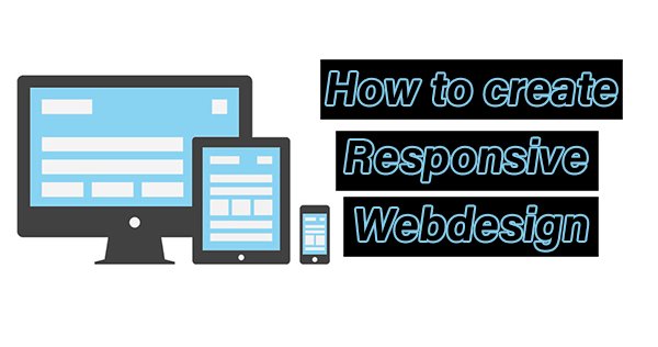
Responsive Web Design (RWD)is the best way to optimize website viewing in different kinds of devices such as desktop, tablet, mobile, etc. This kind of website gets more traffic to compare to other websites. A responsive website dynamically reduces website size and increases website loading speed for various devices.
Some responsive frameworks give the ability to design responsive websites. If you design a new responsive theme or change your website theme as responsive, that will definitely increase your website quality and users. Google officially recommended Responsive web design. This tutorial is suitable for beginners, intermediate users, professionals in web design.
Difference between an ordinary CSS Style sheet and a Responsive CSS Style sheet.
In Responsive webdesign, some CSS style sheet element defined in %.
img {
max-width : 100%;
}
In Responsive Webdesign, the CSS Style sheet contains an @media query to change rules and sizes based on various devices.
Example: @media only screen and (max-width: 600px) { .. } [for smart phones]
@media only screen and (min-width: 992px) {..} [for desktops]
So How to Create Responsive Web Design Based Website?
Step 1: First create an HTML file with CSS Id and Class for your theme.
<html>
<head>
<title> Demo about Responsive Webdesign </title>
</head>
<body>
<header>
<h1>responsive Web Design tutorial</h1>
</header>
<article id="one">
<h2>Responsive Web Design</h2>
<section class="one">
<p>Some Demo Content here...</p>
</section>
</article>
<aside>
<h2>sidebar</h2>
<p>Some Demo Content here...</p>
<p>Some Demo Content here...</P>
</aside>
<footer>
<p>Copy Right information</p>
</footer>
</body>
</html>
Step 2: Add Viewport Meta tag
First of all, you need to trigger the browser to render your website page more readable scale. So add the following meta viewport tag before. It will say that your website page is properly scaled inside any screen size such as a mobile screen.
Step 3: Next you need to add a style sheet.
you have two ways to add a style sheet.
first way: use tag inside the tag in your HTML file.
Add CSS rules inside this tag.
Next way: Create a separate style sheet and link this style sheet inside the tag in your HTML file.
Example :
Here change style.css name instead of your CSS file name.
Step 4:open your .css file and add CSS rules.
First clear spaces and margin from all elements such as article, header, etc.
aside, article, section, header, footer, nav {
display: block;
}
aside, article, section, header, footer, nav, html, body, p, h1, h2, h3, div {
margin: 0;
padding: 0;
}
Add Some background for your theme
html {
background: #EDEDED;
}
body {
margin: 0 auto;
background: #fff;
font: 90%/1.6 georgia,serif;
}
Give some content styles
/*content styling*/
header {
background: #F7A42F;
padding: 50px 25px 10px 0;
color: #fff;
margin-bottom: 2em;
}
h1 {
text-align: right;
font-size: 3em;
font-weight: normal;
font-variant: small-caps;
letter-spacing: .1em;
}
p {
margin-bottom: 1em;
}
article {
text-align: justify;
}
article h2 {
font-size: 2em;
font-weight: normal;
margin-bottom: .2em;
}
article p {
font-size: 1.2em;
margin-bottom: 1em;
}
aside {
font: .9em sans-serif;
}
aside h2 {
font-size: 1.2em;
margin-bottom: 1em;
}
footer {
background: #E08B14;
font: 1.2em sans-serif;
text-transform: uppercase;
letter-spacing: .2em;
text-align: center;
color: #fff;
}
Step 4: Next add some media query inside your CSS.
If you want to create a responsive design, first you need to assign or edit some media query inside your .CSS style sheet file.
Media queries are used to skip or change CSS rules in minimum or maximum width of devices.
If you want to know various devices displayed pixel density use the Wikipedia list.
/*layout styles*/
@media all and (min-width: 780px) {
/*layout*/
body {
width: 85%;
max-width: 1280px;
min-width: 960px;
}
article {
float: left;
width: 64%;
padding-left: 2.5%;
}
aside {
float: right;
width: 26%;
padding: 0 2.5%;
border-left: 1px solid #aaa;
}
section {
-webkit-column-count: 1;
-moz-column-count: 1;
column-count: 1;
-webkit-column-gap: 1em;
-moz-column-gap: 1em;
column-gap: 1em;
padding-bottom: 1em;
margin-bottom: 1em;
border-bottom: 1px solid black;
}
section:last-of-type {
border-bottom: none;
}
footer {
clear: both;
padding: 25px 0 15px;
}
}
@media all and (min-width: 481px) and (max-width: 780px) {
/*layout*/
body {
width: 90%;
max-width: 780px;
min-width: 485px;
font-size: 80%;
}
article {
float: left;
width: 56%;
padding-left: 2.5%;
}
aside {
float: right;
width: 34%;
padding: 0 2.5%;
border-left: 1px solid #aaa;
}
footer {
clear: both;
padding: 25px 0 15px;
}
/*content styles*/
h1 {
font-size: 2.4em;
}
footer {
font-size: 1em;
}
}
@media all and (max-width: 480px) {
/*layout*/
body {
width: 90%;
max-width: 480px;
}
article {
padding: 0 5%;
}
footer {
padding: 25px 0 15px;
}
/*content styles*/
header {
padding: 25px 15px 5px 0;
}
h1 {
text-align: right;
font-size: 2em;
}
article {
text-align: left;
margin-bottom: 1em;
}
aside {
border-top: 1px solid black;
padding: 1em 5% 0;
line-height: 2;
}
footer {
font-size: .7em;
}
}
Now save your file and open this file in your browser. Scale your browser to check it’s responsive.
Google officially recommended CSS media query for smartphones is:
@media only screen and (max-width: 640px) { … }
Targeted media queries for smartphones (landscape), tablets (portrait), desktops (narrow) is:
@media screen and (min-width: 480px) and (max-width: 800px) {..}
Targeted media queries for smartphones (portrait) is :
@media screen and max-width: 479px){..}
Targeted media queries to adjust flows and looks on various devices is :
Landscape Mode :
@media all and (orientation: landscape) {…}
portrait mode :
@media all and (orientation: portrait) {..}